
Vasconcelos Balieiro Advogados establishes a new standard in legal excellence, merging formidable expertise with a modern, client-centric approach. 4LDESIGN was engaged to build this premier brand from the ground up, designing for both the firm's authoritative stature and its audience's needs.
The 4LDESIGN team began with deep discovery, analyzing the competitive legal landscape and defining the unique value proposition for a new kind of law office. This strategic work informed the subsequent design of a sophisticated brand identity, an intuitive user experience for the new website, and a comprehensive suite of digital assets. Our work included architecting a clear user journey for potential clients and developing a scalable branding system for social media to ensure a consistent and impactful market launch for VBA.
The 4LDESIGN team began with deep discovery, analyzing the competitive legal landscape and defining the unique value proposition for a new kind of law office. This strategic work informed the subsequent design of a sophisticated brand identity, an intuitive user experience for the new website, and a comprehensive suite of digital assets. Our work included architecting a clear user journey for potential clients and developing a scalable branding system for social media to ensure a consistent and impactful market launch for VBA.

Role
Branding, Design Consultant and Web Design

Deliverables
Brand Guidelines, Social Media, Responsive Website

Team
Branding, FMD.DESIGN team, and CEO
Branding
The brand identity for Vasconcelos Balieiro Advogados was meticulously crafted to reflect its values of precision, trust, and modern excellence. Here’s a breakdown of the key design choices:
Typography
We selected Inter for its exceptional clarity, neutrality, and high legibility across all digital and print mediums. As a typeface designed for user interfaces, it communicates information with utmost efficiency and professionalism—a critical attribute for a law firm where clarity is paramount. Its balanced and approachable character set reinforces VBA's commitment to being both authoritative and client-focused.
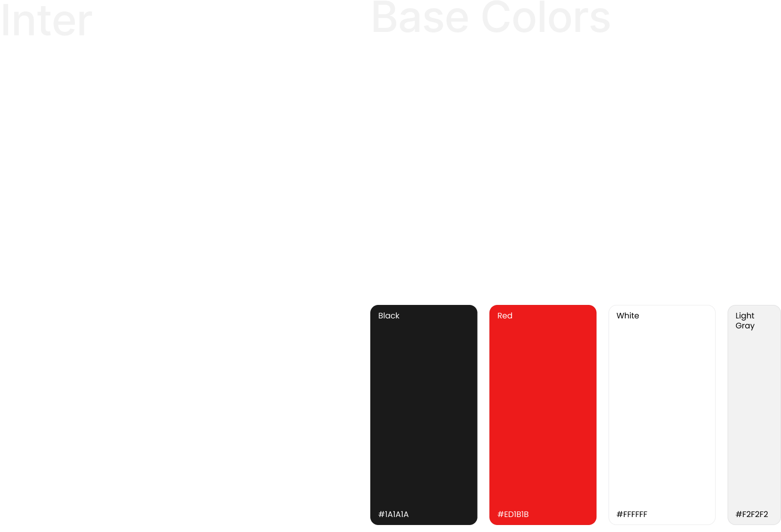
Color Palette: Red & White
The primary color, a bold red, is a powerful symbol of confidence, authority, and action. It commands attention and conveys a sense of passion and assurance. This vibrant red is paired with clean white to create a striking contrast that signifies clarity, simplicity, and truth. This combination is both memorable and classic, ensuring the brand stands out with sophistication.
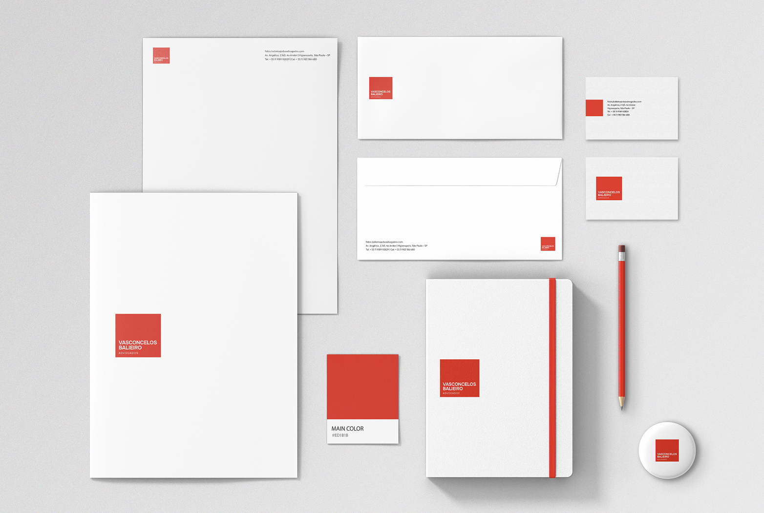
Logo Design: Structured Elegance
The logo is a study in balance and impact. It is presented as a perfect red square, a shape that denotes stability, equality, and professionalism. The name "Vasconcelos Balieiro Advogados" is set in clean, white Inter typeface, with one word below the other. This stacked, centered arrangement creates a strong, iconic mark that is easily recognizable and conveys order and structure.
Design Inspiration: Swiss Precision
The design is consciously inspired by the Swiss flag, renowned worldwide as a symbol of neutrality, precision, and unwavering reliability. This influence is realized through the use of a bold, geometric red square and ample white space. This "white space" is a crucial element, providing a sense of breathing room, modernity, and elegance. It frames the content, enhances readability, and elevates the overall perception of the brand to one of refined, trustworthy expertise.
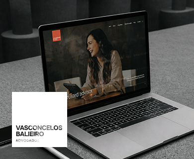
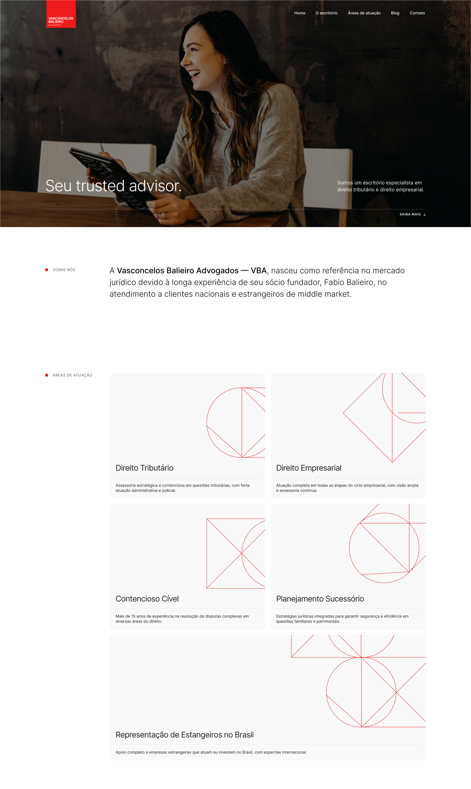
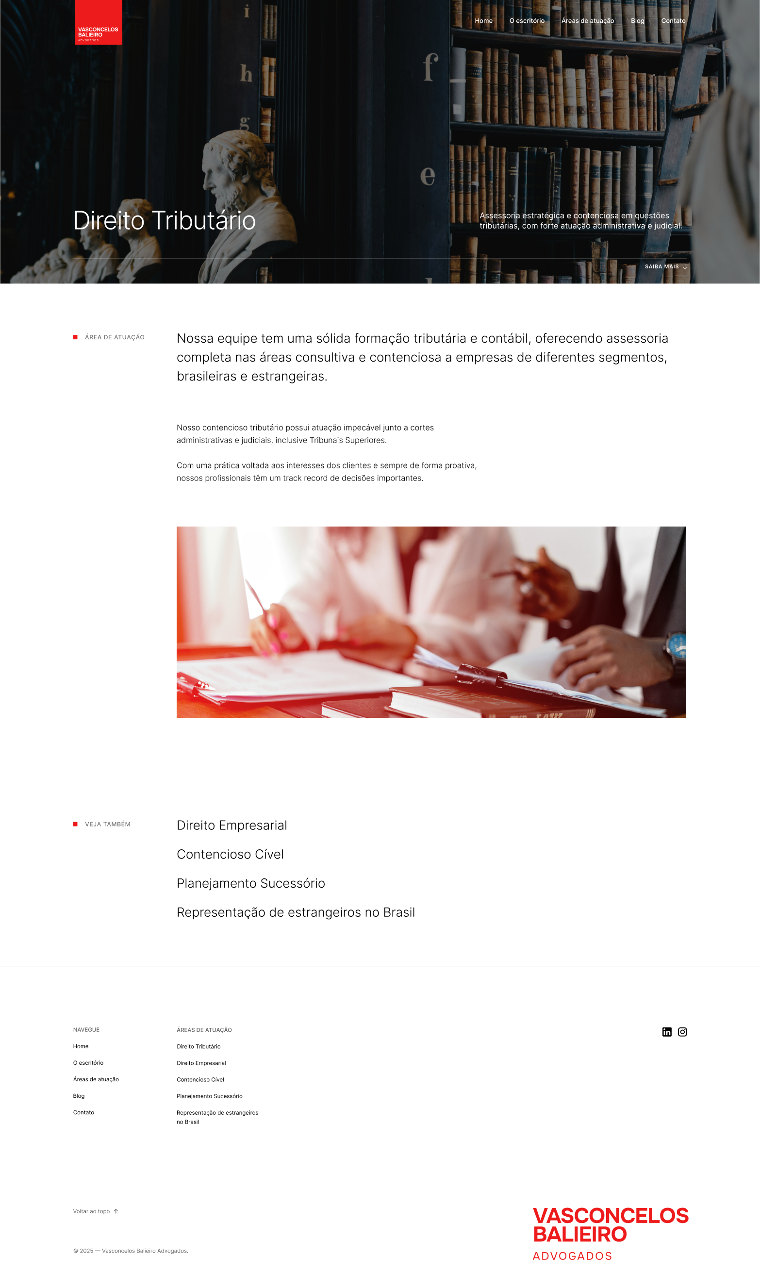
A Digital Embodiment of Trust and Precision
The website for Vasconcelos Balieiro Advogados extends the firm's powerful brand identity into a seamless digital experience. Every design choice reinforces their position as a leading, modern, and trustworthy legal authority.
Beyond aesthetics, the site is engineered for purpose. The intuitive navigation, clear presentation of services, and prominent contact information are all designed to guide potential clients effortlessly toward engaging the firm's services, mirroring the precision and efficiency the brand embodies.
The result is a website that doesn’t just look impressive—it builds trust and communicates competence from the first click.
Visit the website

Looking to achieve similar
outcomes for your product?
Let's Talk
Contact Us


